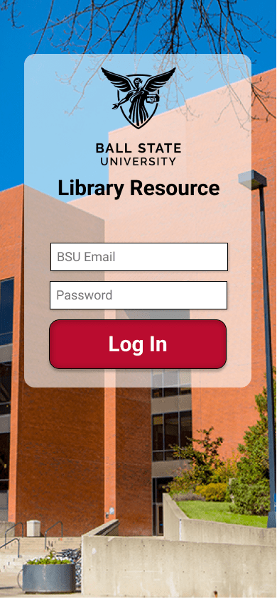
Project Overview
Ball State University’s Bracken Library is large and maze-like in structure, especially to new students who are unfamiliar with it. There are no maps posted anywhere within the building that might help with this navigation issue. Upon further research through interviews with students at the university it was also discovered that many don’t take advantage of any of the events available at the library and many don’t know what different materials are available for check-out either.
My Role: UI/UX Designer and Researcher
Problem Statement
How might we make navigating Ball State’s Library an easier experience for those who visit and better inform them of all the resources it has to offer?
Early Project Ideation
Early on the project was slated to have both a digital and a physical product. While the idea of a mobile application has always been part of the project there was also to be a minor transformation of the main lobby of the library. Likely an interactive digital map kiosk that students could use in the same way they do the app. This part of the project was cut due to time.
Features and organization for the app were brainstormed after research done through an ethnographic observation perform within the library and 3 interviews. 2 of these interviews were done with female university undergrads and the last was done with a male senior librarian employed through the university.
Through these interviews especially I was able to identify multiple issues that were common with university students interacting with the library, such as:
- Students have trouble finding materials inside the library after searching through the database because there is no map.
- Students are not aware of the scope of materials available for check out.
- Students wish the process for checking out materials was faster or able to be completed without having to deal with lines or other people.
- Many students have trouble when using OneSearch because of the vast number of databases it pulls from and the general search for inclusion of a word.
Through this initial research the first low-fidelity prototype was created using index cards. This enabled me to get my first true feedback on the application through testing with different university students.
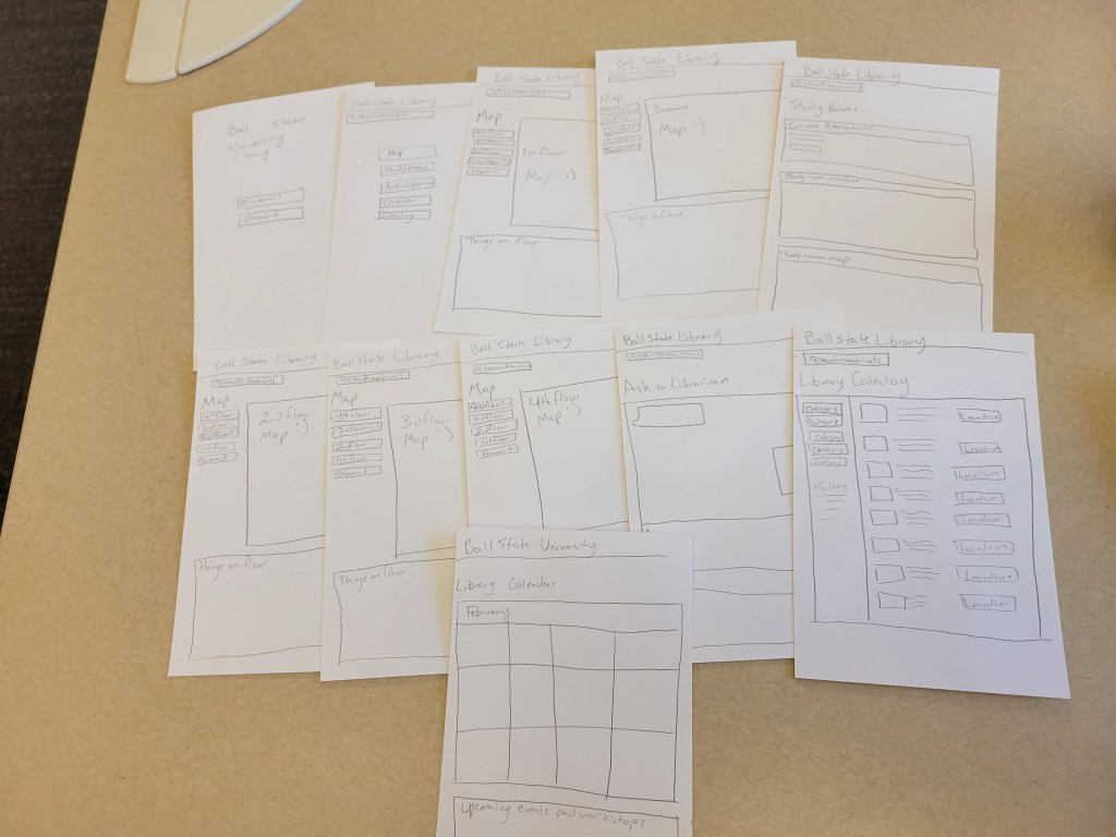
Feedback received on the paper prototype was then applied to a digital prototype, which was created and tested using Figma.
Layout/User Flow

Features
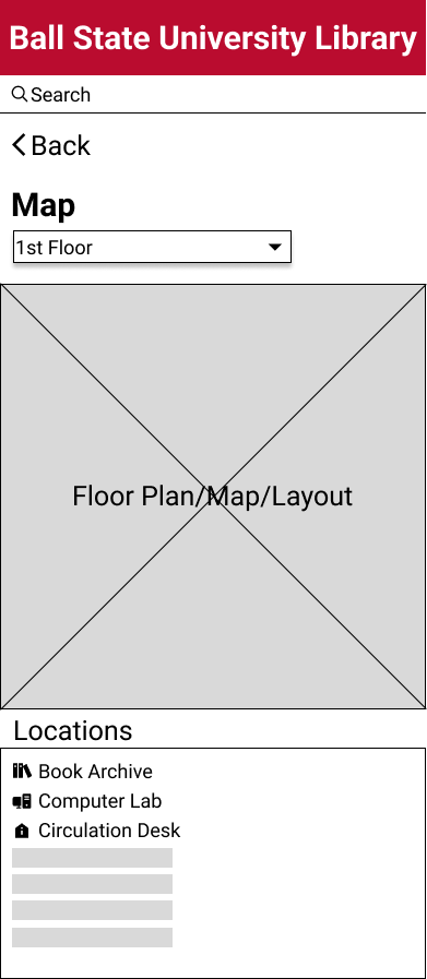
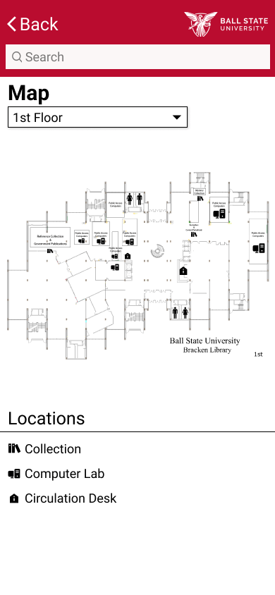
Map screen before and after from Low-Fidelity to High-fidelity
Informative Map screen separated by floor and searchable when using the library material catalog, event catalog, and room reservation.
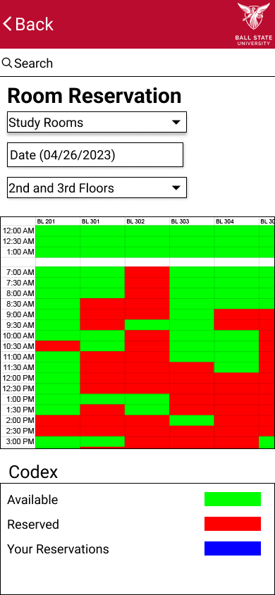
Interactive room reservation calendar for the library’s many study, meeting, and conference rooms.
A codex is available at the bottom for ease of use.
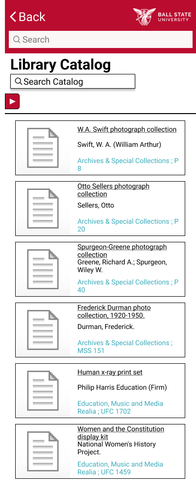
A catalog of all materials kept within the library physically and available digitally.
Locations listed for materials lead to the appropriate map screen.
Style Guide
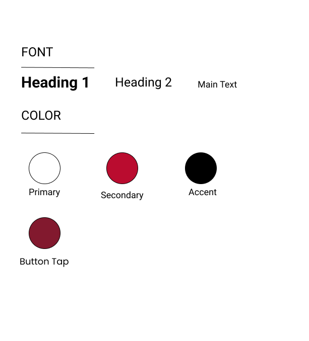
All coloring, typography, and branding fall in line with Ball State University’s official style guide.
Reflection
This project was my first adventure into UI Research and Design. Along with this, it was also my first experience using Figma. This project has given me a greater respect for research that goes into creating an effective product. Especially when it comes to the need to streamline human interaction with an already existing system such as a library.
In the future this project would benefit from the reintroduction of work within the physical space of the library as well as adding more functions to the app that would give students access to even more resources available on the library’s current website.
